数据:布里斯班致命车祸
我将使用昆士兰道路车辆事故数据集,该数据集可从昆士兰开放数据门户获取。该数据集提供了昆士兰州2001年1月1日至2023年11月30日期间所有已报告的道路交通事故的地点和特征信息。
我只想关注致命事故,所以唯一需要关注的三列是Crash_Longitude、Crash_Latitutde和Count_Casualty_Fatality。当然,也只有那些发生致命事故的事故(Count_Casualty_Fatality > 0)。
import pandas as pdfatal_crashes = pd.read_csv("../data/qld-road-crash-locations.csv",usecols=["Crash_Longitude", "Crash_Latitude", "Count_Casualty_Fatality"],
)
fatal_crashes = fatal_crashes[fatal_crashes["Count_Casualty_Fatality"] > 0]以上数据仍然涵盖整个昆士兰州,因此下一步是获取布里斯班的议会边界,并仅保留发生在议会边界内的事故。我将使用GeoParquet文件(已在 GitHub 上分享)来实现此目的。
import geopandas as gpd# dissolve because we only need the outer boundaries
brisbane = gpd.read_parquet("../data/brisbane-suburbs.parq").dissolve()# convert to a geodataframe
fatal_crashes = (gpd.GeoDataFrame(fatal_crashes,geometry=gpd.points_from_xy(fatal_crashes["Crash_Longitude"], fatal_crashes["Crash_Latitude"]),crs=brisbane.crs,).drop(columns=["Crash_Longitude", "Crash_Latitude"]).clip(brisbane)
)
首次尝试使用 geoplot
当我使用geoplot示例(此处)时,出现了一个错误,这很可能是由于Seaborn或Matplotlib'MultiPolygon' object is not iterable的 API 更改造成的,因为geoplot上次更新是两年前。或许也与这个未解决的问题有关。
import geoplot as gplt
import matplotlib.pyplot as plt
import contextily as cxfig, ax = plt.subplots()gplt.kdeplot(fatal_crashes,cmap='viridis',thresh=0.05,clip=brisbane.geometry,ax=ax
)
gplt.polyplot(brisbane, zorder=1, ax=ax)

初始 KDE 图
于是,我开始寻找自己的解决方案,这时我偶然发现了Håvard Wallin Aagesen 的这篇文章,它展示了如何使用Seaborn的 kdeplot 进行地理空间分析。我受此启发,生成了一个类似于geoplot示例中的图表。
第一步是使用Seaborn绘制 KDE 图。我们可以在下图中看到,seaborn 默认绘制了 10 条轮廓线。
import matplotlib.pyplot as plt
import seaborn as snsfig, ax = plt.subplots()
brisbane.boundary.plot(ax=ax, edgecolor="black", linewidth=0.5)
sns.kdeplot(fatal_crashes,x=fatal_crashes.geometry.x,y=fatal_crashes.geometry.y,weights="Count_Casualty_Fatality",cmap="viridis",ax=ax,
)
ax.set(xlabel="", ylabel="")
plt.show()
我们可以看到一些轮廓超出了城市的边界,但在 geoplot 的参考示例中,轮廓在城市范围内,这正是我想要实现的。
解决方案是单独访问这些轮廓,将它们转换为多边形(或多多边形),然后使用城市边界进行修剪。最初的想法归功于这篇 Medium 文章。那篇文章中的一些示例代码对我来说不起作用(可能是因为 seaborn 的上游改动?)。
获取单个轮廓区域
Seaborn返回一个子集合kdeplot,其中包括一个QuadContourSet包含有关轮廓和轮廓区域信息的实例。
kde = sns.kdeplot(fatal_crashes,x=fatal_crashes.geometry.x,y=fatal_crashes.geometry.y,weights="Count_Casualty_Fatality",cmap="viridis",
)
[<matplotlib.contour.QuadContourSet object at 0x7fe103723800>,<matplotlib.spines.Spine object at 0x7fe10353c920>,<matplotlib.spines.Spine object at 0x7fe10353e750>,<matplotlib.spines.Spine object at 0x7fe10357ea80>,<matplotlib.spines.Spine object at 0x7fe10357ee70>,<matplotlib.axis.XAxis object at 0x7fe103a38500>,<matplotlib.axis.YAxis object at 0x7fe10357f080>,Text(0.5, 1.0, ''),Text(0.0, 1.0, ''),Text(1.0, 1.0, ''),<matplotlib.patches.Rectangle object at 0x7fe103723f20>]将轮廓区域裁剪至边界
每个QuadCountourSet实例都是轮廓路径的集合,我们可以用该方法访问它们。我们可以用该方法get_paths生成一个形状优美的多边形to_polygons。
# credit to https://towardsdatascience.com/from-kernel-density-estimation-to-spatial-analysis-in-python-64ddcdb6bc9b/from shapely import Polygon
from matplotlib.contour import QuadContourSetcontour_set = None
for i in kde.get_children():if type(i) is QuadContourSet:contour_set = ibreakcontour_paths = []
# Loop through all contours
for contour in contour_set.get_paths():# Create a polygon for the countour# First polygon is the main countour, the rest are holesfor ncp, cp in enumerate(contour.to_polygons()):x = cp[:, 0]y = cp[:, 1]new_shape = Polygon([(i[0], i[1]) for i in zip(x, y)])if ncp == 0:poly = new_shapeelse:# Remove holes, if anypoly = poly.difference(new_shape)# Append polygon to listcontour_paths.append(poly)# make holes corresponding to the inner contours
contour_polys = [contour_paths[i].difference(contour_paths[i + 1])for i in range(len(contour_paths) - 2)
] + [contour_paths[-1]]df = pd.DataFrame(zip(contour_set.levels, contour_polys), columns=["level", "geometry"])
gdf = gpd.GeoDataFrame(df, crs=brisbane.crs)clipped_kde_gdf = gdf.clip(brisbane)现在,如果我们绘制clipped_kde_gdf,我们可以看到轮廓已经很好地剪切到布里斯班的边界。

最终情节
最后,我们可以绘制完整的情节,这次使用一些背景图块。
import contextily as cxfig, ax = plt.subplots()
brisbane.boundary.plot(ax=ax, edgecolor="black", linewidth=0.5)
cx.add_basemap(ax, crs=brisbane.crs, source=cx.providers.CartoDB.Voyager)
clipped_kde_gdf.plot("level", ax=ax, cmap="viridis", alpha=0.7)
ax.set(xlabel="", ylabel="")
plt.show()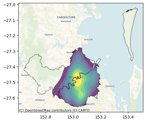


![[SWPUCTF 2023 秋季新生赛]Classical Cipher203分古典密码Base家族栅栏密码](https://i-blog.csdnimg.cn/direct/20a8c3db15884c45bfd947949f38482f.png)